Gemma Kate Lifestyle
Sector: Health and Wellness
About the client: Gemma Kate Lifestyle is a fitness and wellbeing community, which brings like-minded people together through primarily fitness in a sociable and engaging way.
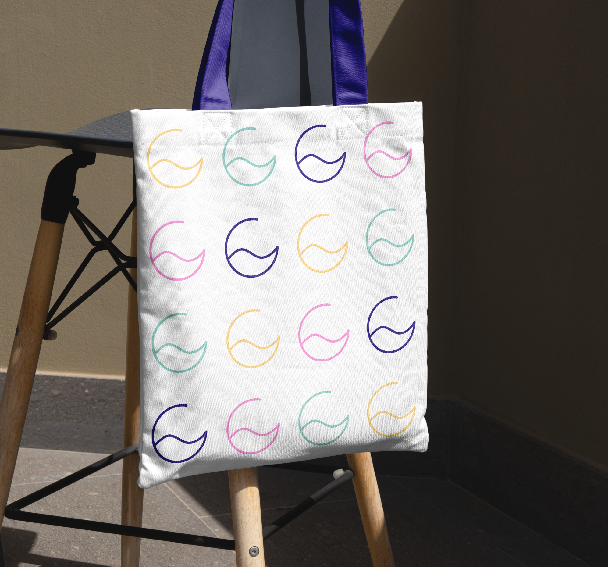
My role/focus: I worked with Gemma to create an identity which feels modern and clean, but also has elements of her at the centre. The icon is based around the letter ‘G’, representing that she is at the heart of her business, as well as the sea, which is a core location for her workout, and to also represent the movement that her brand inspires.
Identity
My Approach: The colours for Gemma Kate Lifestyle are intended to be inspire, stand out and engage clients and potential customers primarily on social media.
I also wanted this logo to feel modern and fashionable, and something members feel connected to.